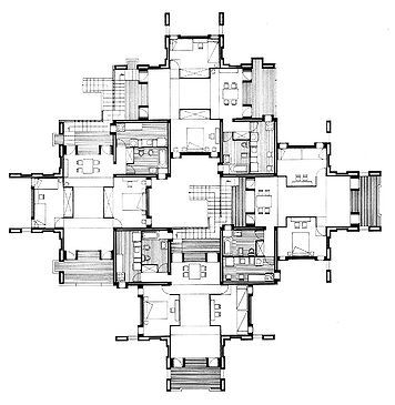
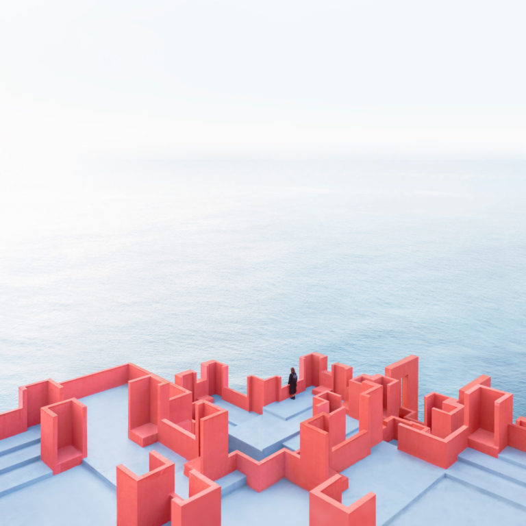
La Muralla Roja’s architecture was designed as a reference to the architecture of the Arab Mediterranean, particularly the adobe towers found in North Africa. Ricardo Bofill chose to deviate from the accepted architectural practice of dividing public and private spaces, by reinterpreting the Mediterranean tradition of the casbah. Described as a ‘labyrinth’, La Muralla Roja’s geometric plan was based on the typology of the Greek cross. Grouped in different ways, each arm on a cross is five metres in length, intersecting at the service towers which house the kitchens and bathrooms. The building is evocative of constructivist architecture and merged elements of the modern age.’ La Muralla Roja’s complex form combines a series of interlocking stairs, platforms, and bridges, providing access to fifty apartments of different sizes as well as a roof terrace with solariums, a swimming pool, and a sauna.
The Muralla Roja responds to a geometric plan that arises from the Greek cross as a plant, with arms 5 meters long, grouped in different ways and have service towers, where kitchens and bathrooms are arranged at the intersections. This geometry also thus approaches constructivist theories and their characteristic dynamism.
This “fortress between cliffs” with the typical structure of the oldest fortifications in North Africa consists of a set of courtyards interconnected between high walls and towers. From which you access the 50 apartments that make up the construction. And that include studios of 60 square meters and two- and three-bedroom apartments of 80 and 120 square meters, respectively. The terraces of the modern kasbah have a solarium, swimming pool and even a sauna, for the use of its residents.
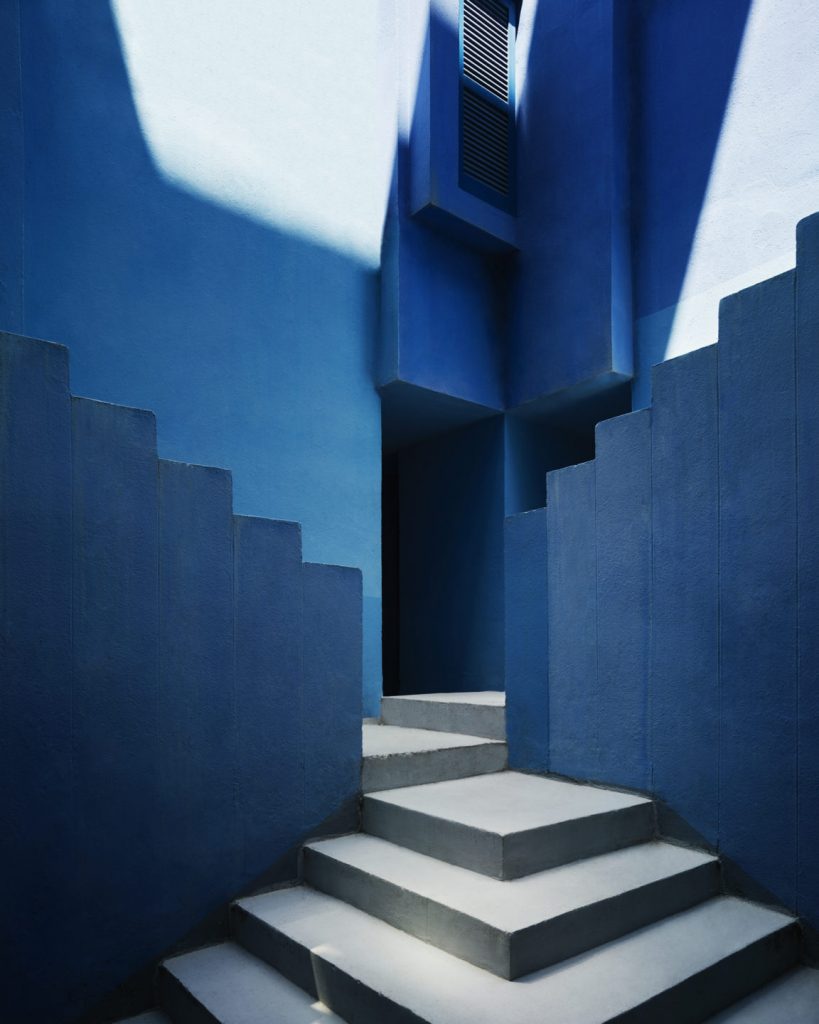
The stairs of the Muralla Roja offer the visitor the sensation of sneaking into an impossible painting by M. C. Escher. A maze of levels in which to get lost to discover amazing corners. And between the walls, a puff of color.
Bofill and his team applied a range of tones on the Muralla Roja that provide “relief to the different architectural elements, according to their structural functions,” as explained from the Taller de Arquitectura.
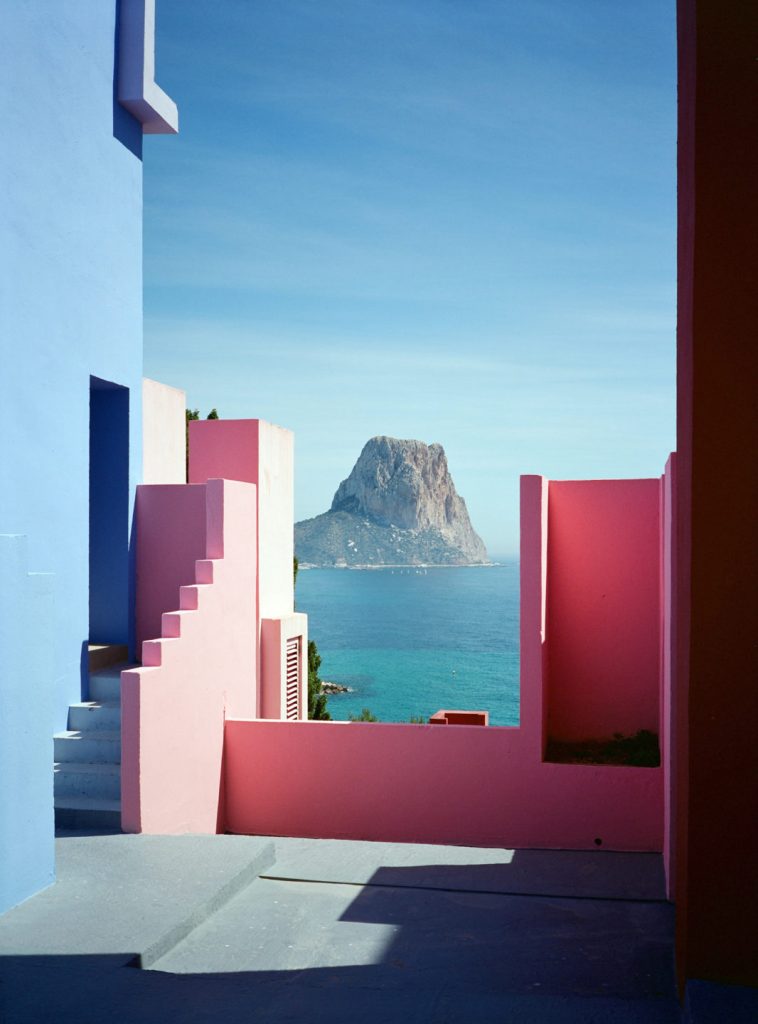
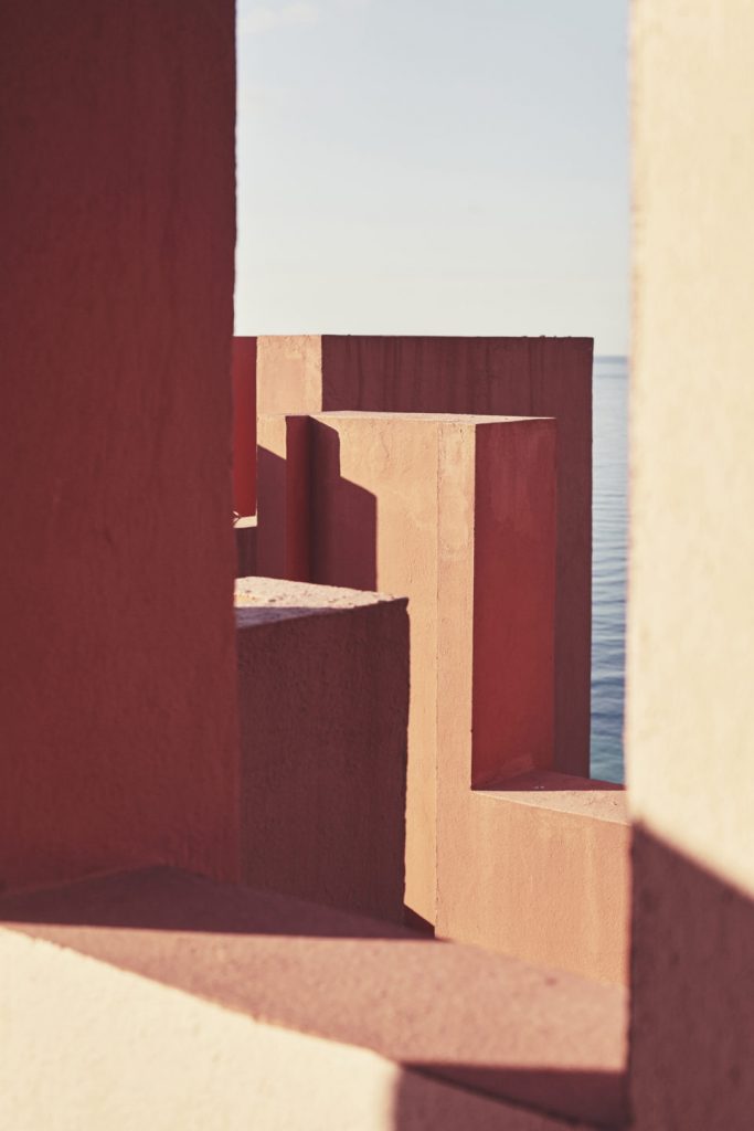
The exterior is painted in various shades of red, which accentuate the contrast with the landscape on the steep coast of Alicante. In opposition, the constructive elements of connection and common areas, courtyards and stairs, which were treated with the range of blue, ranging from sky blue to indigo and violet. In this way it is possible to produce an intense connection with the sky. With greater or lesser force, we can even observe the amazing optical effect of mixing with it by looking at the horizon.
The intensities of each color are also related to light. Successfully achieving a greater illusion of space thanks to a game of shadows.
In conclusion La Muralla Roja is one of the most eyechatching architectural compositions. Being a lover of colors i can’t but be admirative of this work of art. I hope that i will be able to visit it someday this year.

